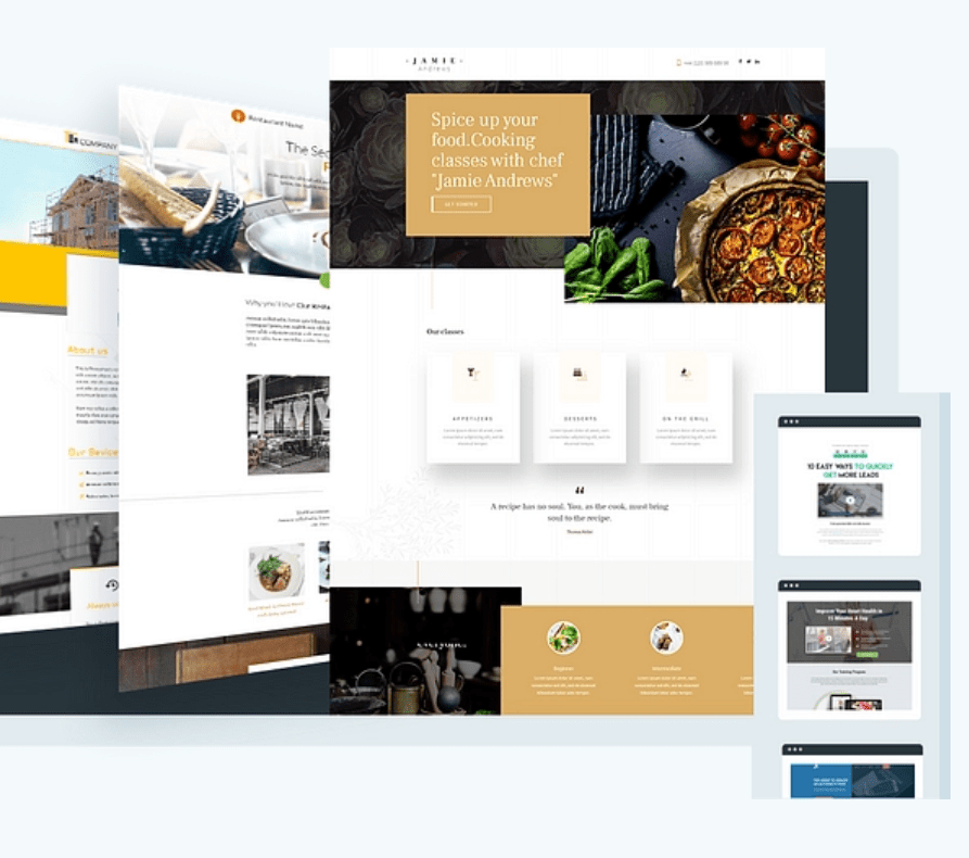
Do you know about thrive architect and how it works? In this thrive architect review I would like to show you Thrive Theme in depth.
👉 Are you struggling to create decent-looking pages on your website?
Or are you so frustrated that you are considering hiring a web designer?
Thrive Architect, the new Thrive Themes WordPress plugin could be the answer to your problems.
In this thrive architect review, we’ll show you how easy it is to create visually stunning pages (and posts), without wasting a ton of time and money.
Thrive Architect: Table of Contents
Creating pages with the WordPress editor is like going to the dentist. You never know how it will turn out. At best, it’s an anxious wait. At worst, it is painful.
Although WordPress is a great blogging tool, it was never thought of building professional-looking web pages. It is something that WordPress developers are looking to address with their Gutenberg project.
Thrive Architect is a visual page builder plugin for WordPress that helps you to create great-looking, conversion-focused pages.
According to Thrive Themes:
It is the fastest and most intuitive visual editor for WordPress.
The idea is to allow you to build your pages as quickly as possible using the drag and drop editor so you don’t spend endless hours fiddling with shortcuts, CSS and HTML.
Using “Thrive Architect”, you can:
✔️Create a home page using one of the pre-designed templates or by adding elements like icons, buttons or columns to your current theme.
✔️Build landing pages with built-in Lead Generation elements to help grow your mailing list.
✔️Format blog posts with features like content boxes and style lists to make them stand out from the crowd.
✔️Create sales pages, webinar pages, product launch pages, and more.
Building your pages with Thrive Architect
→There are two ways to build a website with Thrive Architect. You can use a pre-designed landing page template, or you can start from scratch with a blank template.

→Both ways are valid. You just have to decide which one you want. When you create a new page, you choose the Launch Thrive Architect button:
Taking this option opens a new tab/window:
At the top of the page is the default header menu and the page title that you would expect to see from your topic.
Buy Thrive Architect Web Builder Now
Click on the “+” button icon on the right side of the page and the Prosperity Architect menu will appear. So, let’s take a look at how that works Using the landing page templates
Thrive Architect includes hundreds of predesigned landing page templates. The beauty of these pages is that they can almost be published immediately. You’ll have to dive in and edit the copy to suit your business, but at least you have the foundation for a quick start. Clicking on the “Cloud” button icon will bring up a template window.
Landing page template sets
→Thrive groups your landing pages into template sets. At the time of writing, there are 40 sets of landing page templates in their library, with more to come soon.
→7 powerful social media scheduling tools to save you hours every week.
→Each page set uses the same layout components to create a consistent look.
→For example, here is the last set – Atomic. Notice that each page has the same mark:
Atomic Template Set Includes:
- ✔️Lead Generation Page
- ✔️Lead generation page in 2 steps
- ✔️Confirmation page
- ✔️Download page
- ✔️Video sale page
- ✔️Webinar registration page
- ✔️Webinar streaming page
- ✔️Webinar Replay Page
- ✔️Customize a template
Once you’ve chosen a landing page template, you can start customizing it with the visual WYSIWYG editor.
Each page is made up of elements; for example, header, text, button, icon, etc. As soon as an item is selected on the page, its editing options appear in the sidebar menu.
For example, if you choose the Heading element, you can change the text, alter its layout and position, apply a background style, add a border, and more:
Note: Thrive Architect labels the item in various places on the screen, so you can be sure that you are editing the correct content.
Here’s the original Storyteller 2-step landing page template:
And here is the custom template after changing the button color, and the font and header color:
Access Avada Best selling Theme
In just a few clicks you can adjust the page to fit your style and brand. Also, you can save your version of the template to use again.
What is important to remember is that all these changes are immediately visible on the edit screen. You can switch to the preview mode if you want, but it really isn’t necessary as you can see everything in front of you.
Thrive Architect is a genuine WYSIWYG visual editor.
Starting with a blank page; Sometimes it is more appropriate to build the page from scratch, starting with a clean canvas. For example, you might like the design of a page that you have seen on another website and decide to try building something similar.
Let’s take a look at three of the powerful and flexible design elements that you can use to build your page.
Don’t worry, I’ll show you the other awesome items;
- Full Width Bottom
Adding a full-width background may not seem like a big deal, but you won’t find this feature in all page builders.
The key setting here is “Content covers the entire width of the screen” as it allows you to have a full-width background no matter what WordPress theme you are using.
There are a couple more settings that I have used to create this background. First, I have added an image as a base coat and then I have applied a solid color coat on top. This helps when you want to start adding text like the heading below.
You can add as many layers as you want to create the effect you want. Other layer options include a gradient color, pattern, and video background.
Before leaving the background, there is one more feature to show you. Using a full-width, two-column background section you can create a vertical split-screen effect:

Once you have your vertical split layout, you can add different content elements. For example, you can have an image and text, a video camera, and a video screenshot, plus many other combinations.
- Content box
The Content Box is a dual-purpose design element in Thrive Architect. It serves as a content container to hold multiple items that you want to treat in the same way, plus you can use it to highlight important parts of the content.
First, we have a content box that contains an icon and a piece of text: Nothing special, maybe?
But, using the drag and drop handle, you can move the Content Box to the background section.
When you have created a content box that you think will be useful again in the future, then Thrive Architect allows you to save it as a Content Template. It’s all part of their Rapid Deployment ideology.
Best Social Sharing Plugins For WordPress: Share Buttons + More
- Testimony
Adding testimonials to your page is a proven way to show social proof. Thrive Architect has over 30 testimonial templates that you can customize:
→Let’s take a look
Chic Light uses two columns for Image and Text. He can drag and drop the column widths to fit his image and text as desired.
The right column contains two Text / Paragraph elements, each with a different font and size. While the left column has three Icons / Images that can be edited.
Using this template you can change the width of the columns, the colors, the images, the icons, the position, and more.
Adding track generation options
Most landing pages have one goal in common: to generate leads.
Thrive Architect has two types of lead generation that you can use on your landing page.
✔️1 step opt-in
The default Lead Generation method is the 1-Step Opt-in.
If you are creating your own landing page, you can drag and drop the Lead Generation element from the sidebar onto your page.
You can choose to stack the fields vertically or run them horizontally. Also, you can customize other features like colors and text.
If you are using a landing page template, then the lead generation element will already be in place:
✔️2 steps opt-in with Thrive Lightbox
The second Lead Generation method available in Thrive Architect is the 2-Step Opt-in, which uses the built-in Thrive Lightbox feature.
You decide which element on your page you want to be the trigger, and then you use the Animation & Action option to invoke a Lightbox. For example, you could configure a Click Button to open the Lightbox with a Zoom effect:
Landing page templates work the same way. For example, the Storyteller 2-Step Opt-in uses the Animation & Action functionality to create a trigger:
Clicking the button opens Thrive’s built-in lightbox:
Like all Thrive Architect pages, you can customize the Lightbox layout with the visual editor.
Email service integration
Whether you use the 1 or 2 step method of capturing email addresses, you will need to connect the Lead Generation form to your email service.
Thrive Architect allows you to connect to your email service via an API or an HTML form:
You have API connections to all of these email service providers:
Check that your page is mobile responsive
Every page you build with Thrive Architect, whether you start from scratch or use a template, responds to mobile needs. But the plugin has three additional mobile responsive features that help you build unique pages.
- →Preview your page in different screen sizes
As you build your page, you are just a couple of clicks away from seeing how it looks on various screen sizes:
- →Toggle the visibility of entire content blocks and elements
For any item, or any Content Box with multiple items in it, you can decide whether it will be shown or hidden. In this example, you can see that the Icon element will be visible on Desktop and Tablet, but hidden on Mobile.
- →Adjust every detail
You can adjust the arrangement and position of elements for different screen sizes without having to create duplicate elements with the show / hide option. For example, in the testimonial box we can change the size of the text and place it below the image after removing the icon element:
As more and more people browse the web with a mobile device, it makes sense for your site to be mobile-responsive. With Thrive Architect, you can provide the best experience, regardless of screen size.
The building blocks of Thrive Architect
You’ve already seen many of the building elements on the Thrive Architect home page. But let’s take a quick look at a few more. 9 powerful ad management plugins for WordPress
Conversion Items
👉In addition to Call-to-Action Buttons, Testimonials, Content Boxes, and Lead Generation Forms, Thrive Architect has four more conversion-focused building blocks:
👉Stylish Lists – Use bulleted lists with custom icons and styling to present your points of sale concisely.
👉Countdown Timers – Add a sense of urgency to your pages with the animated countdown timer and evergreen countdown
👉Content Disclosure – Hide content blocks until a certain amount of time has passed. Perfect for sales videos, where you can reveal the buy button when you get to the “launch” part of the video.
👉Credit Card Icons – Fully scalable credit card icons give your visitors a clear signal for a purchase and build trust.
More components
Apart from the conversion elements, Thrive Architect comes with many more components that you can use to create any page. Here are some of my favorites:
✔️Click to Tweet – Encourage social sharing within your content.
✔️Google Map – Embed a Google map on your site; great for local businesses.
✔️Post Grid – Displays a grid of blog posts or WooCommerce products.
✔️Social Share – Add social share buttons and choose to hide share counts until they exceed a certain number.
✔️Table – Take advantage of the intuitive HTML table builder and editor.
✔️Table of Contents – Automatically generate a table of contents for your page with anchor links that jump to each section.
✔️Video – Embed YouTube, Wistia, Vimeo, or a self-hosted video on your page.
✔️WordPress Content – Convert existing WordPress content into Thrive Architect content and manage it within a self-contained block.
Thrive Architect Page Builder Prices
There are two packages available now;
1.✔️ Thrive Suite Quarterly at $99
2. ✔️Thrive Suite Yearly at $299
1. Thrive Suite Quarterly
$99/Qtly
All Thrive Themes PluginsThrive Theme Builder, Shapeshift, Ommi and KwikUnlimited SupportUnlimited UpdatesAccess to Thrive UniversityInstall on up to 5 websites30 Day Money Back GuaranteeLowest Possible Price
You can get the Thrive Architect program for a quarterly fee of $ 99.
The price includes 12 months of support with the option to renew every year, but you will always get unlimited updates.
2. Thrive Suite Yearly
Get full access at the lowest possible price.
$299/Yrly
Note: Thrive has released a plugin for Thrive Architect that allows you to run a / b split tests without the need to play with any code. It’s called Thrive Optimize.
Testing separate means you can test to find what converts best on your landing pages. This means that you will get more conversions and ultimately more customers.
Click Here to Know More About Thrivetheme plugin
As this plugin only works with Thrive Architect, you can purchase both as a bundle using the link above. But if you already own Thrive Architect, there is an option to buy only Thrive Optimize (the link for this is just below the pricing table).
Pros and cons of architect Thrive
Thrive Architect Pros;
- ✔️Easy to use and visualize your designs
- ✔️Allows you to create content that stands out from the crowd
- ✔️Comes with over 100 landing page templates organized in sets
- ✔️Includes conversion-focused elements to add to your page
- ✔️Includes additional mobile response features
- ✔️Lightweight plugin considering all built-in features
- ✔️Attractive pricing (lifetime updates & 12 month support)
- ✔️A large number of integrations with email service providers
Thrive Architect Cons
✔️Some of the landing page templates seem a bit dated.
FAQ Of Thrive Architect
Thrive Architect Conclusion;
Having pioneered the page building market with Thrive Content Builder in 2014, Thrive has set a new benchmark with Thrive Architect.
In this thrive architect review, I try to describe how to use thrive architect, Thrive Architect price, and Pros & Cons.
If you want to know more about this thrive architect review, Visit: thrivethemes.com
The new visual editor is both intuitive and fast. And the results are impressive.
Creating beautiful, engaging, and visually striking content in WordPress has never been easier.


Leave a Reply